


Focusing on People and Community
OppSites Place Pages
OppSites is a platform aimed at connecting real estate professionals and local businesses with local governments for real-world development projects. The Place Pages was part of a larger project spanning 6 months, with 2 months devoted to strategy/research and 4 months for design/implementation. I served as the only Product/UX Designer on the project, along with 2 engineers, a UX consultant and researcher, and a project manager (our CEO). I’ll be going over the Place Pages portion of the project below.
At a Glance

Project Overview
The OppSites mission has always been to make connections between people and communities, like industry professionals and city governments. However, it was difficult for our users to see it as anything other than a property listing platform. This made it hard to understand and use for a significant portion of our users, especially for users that weren't simply looking for a single project or property. I wanted to address this question: how might we make it easier for users to understand the connection between people, communities, and development projects?
OppSites Marketplace

The OppSites Marketplace Search tool. It functioned similarly to a property listing platform, making it tougher to use for users not just using it as a one time search tool.
Understanding Product Vision & Goals
During the early stages of the project, the team had worked to brainstorm and define the product vision and goals:
-
Focus on community. Economic development is an industry heavily reliant on people and community focused work. Yes, development projects are important but even more is the context of the projects.
-
Be more content driven. Exposing more content not only gives users a better idea of what they can expect from the platform and better encourage them to sign up, it also gives us a better idea of what types of content is effective for user signups and retention.
-
Increase user signup and engagement rates. Metrics are important. The project strived to improve upon user signup (defined by percentage of new signups per visit) and engagement (defined by number of actions per visit) rates.
Research and Ideation
I wanted to address a few main questions in user research and initial ideation:
-
How do we know that learning about other people and communities were important to our users? How important were projects?
-
What was the most effective way to showcase people and communities while incorporating projects? What were shortcomings with what we did before?
-
How might I gain some insight to how users might engage with a page more focused on people, community, and projects?
User Research
What was important to our users? We held user interviews with many of our current users and asked them about what they found to be important to know/learn using the platform. This was done through one on one interviews and through Google Forms.

I used both one-on-one interviews and Google Forms to survey users and potential users. Questions asked focused on understanding the value of people and projects to them, both short and longform.
Some of the main takeaways were:
People make projects. Ultimately, users wanted to connect with people. It was important that users could understand who were the key stakeholders in any one community.
But projects are important, too. Projects let users screen the types of people they were connecting with, especially because many of our users were working with a particular type of development project.
Geography is key. Oftentimes, our users only worked in a specific area or region. Also users, found it important that they were able to learn about projects in other areas as well.
Visual Feedback
We also wanted to understand our users’ feedback on visual design and informational hierarchy, since text and visual surveys often elicit different responses. One series of feedback focused on showing users our old City Profile page, which showed geographically based information. Most users had commented that the page had too much text based information and not enough visual content.

Explorations and Prototyping
As we worked on validating some of the ideas we had around focusing on people and communities, I worked through many iterations to give us some insight as to how certain interfaces might perform with regards to engagement. One of my first concepts focused on visual content presented in a feed. Users would be presented information organized under a single geography without a map, while the information presented would be reflective of activity in the location (headlined by projects and people), organized by recency. While many users reacted positively to the increased focus on visual content, we also needed a simpler concept that could be scaled quickly for better validation.

One of many iterations I did of Place Pages. Conceptually, I tried focusing on a content feed approach in displaying information, highlighting people and projects through recent activity.
Another iteration focused more on simplicity, bringing forward content specifically highlighting communities of people. Again the map was removed, and Users would directly search for others with simple filters like location. Projects were not highlighted directly, but instead each User's project priorities were displayed along with the User and a direct message call to action.
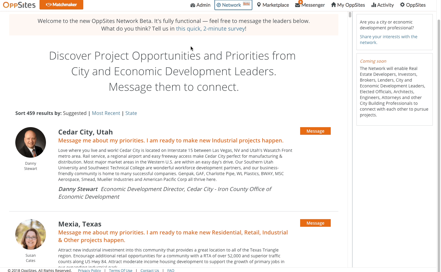
The prototype was called the OppSites Network Beta, and was given to our users to test via a link (which was accessible through OppSites.com and emails). We tested about 100 users total with this method.
From the breadth of our research and testing, the team and I learned a lot and made significant progress. Here were some of our most important findings:
-
our Users did think in terms of geography, but it's best to put one in focus at a time
-
projects and people should both be highlighted with equal importance
-
deviating too much from familiar UI elements confused our Users (the removal of the map being a prime example)
-
content was best displayed visually with the least amount of text
-
bringing forth calls to action was effective in increasing User engagement, but having too many too abruptly diluted their importance
Low Fidelity Designs
By synthesizing our learnings from the collective User research, visual feedback, and prototyping sessions, I began to move forward with designs of the feature. Something I was actively cognizant of was User feedback and reintegrating the map, especially useful when focusing on a single geography for the feature.

Some sketches I did, focused on content but organized by a single geography with a map. I tried different ways to organized the content, but found the top-down approach most effective.

Low fidelity mockups of the Place Page, with several elements integrated based on learnings - bringing back the map, visual content, feed presentation, with a single call to action.
Final Design Frameworks
Informational Hierarchy
Understanding location was an important contextual part of the page. A map was great way to convey this context and was emphasized. Modular design helped convey this context, tying all the content back to the location, even when display or scroll states changed.

Low fidelity wireframes of the structure of the place page. I focused on maintaining informational clarity through modularity of content, useful when scrolling or resizing the page.
Content Cards
Content driven pages needed a design that conveyed a lot of information without taking too much space for text, as I had found in research and testing. I designed several cards to address this problem. For a deeper exploration of the design of the cards and card system, feel free to ask me!
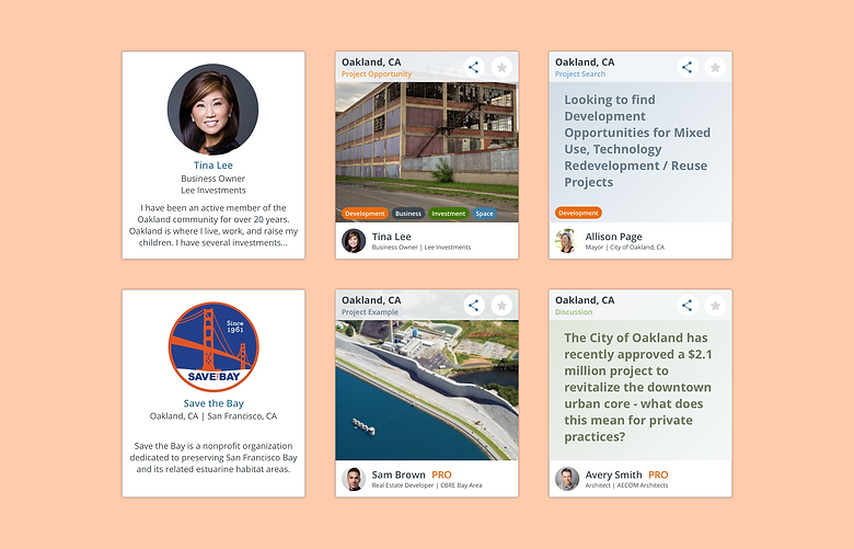
Content card designs highlighting People, Organizations, Projects, and Discussions.
Strong Calls to Action
A conscious effort was made to incorporate calls to action through the Place Page. By organizing the pages in this way, the design was able to accommodate a signup CTA that fit within the broader message of the Place Page in addition to highlighting other locations.

Users can join places, prompting them to sign up if they aren't already. Onced joined, users will receive information/updates about the place they have joined.
Results and Conclusions
The final design of the Place Pages focused on balancing people and projects in addition to communities. Tweaks to the map and content cards, as well as giving users the ability to toggle between the types of information on the page, were made before shipping the final design for production.

As a result of the new Place Page feature, we saw a 50% increase rate of signups and a 20% increase in engagement from before (meaning that once users had reached the Place Page, they were much more likely to engage with the content and sign up). The rate here was crucially important, as it meant that the feature was more effective despite a reduction in external variables - such as a reduced marketing budget.
Subsequent user sessions (conducted as 'Community Forums') shown that users had better understood the message of the Place Page. Coupled with the increase in performance metrics, we felt that this Place Pages were a successful way to make it easier for users to understand the connection between people, communities, and development projects.
Designing the Place Page proved to be a challenge, balancing the needs of our users with the direction of OppSites as a product. As with many projects, there were many areas of research, testing, and design I wanted to explore more; these included holding testing sessions around how well users retained information on the page, or finding the optimal balance of people and projects to display. But staying true to a strategy and timeline most definitely helped me understand the design process in my work, how to balance that with financial and time constraints, and ultimately made me a better designer. You can follow the work at oppsites.com!